Sunday, December 11, 2011

Final Project: Connections

My final painting was inspired by an experience I had this summer while studying abroad in Ecuador, as well as a fascination I have for bridges. When thinking about what it is that a bridge does, I was able to think about it metaphorically in relation to life. Literally the bridge is a connector between two places. Sometimes between two pieces of land while passing over water, other times simply passing over another road or in this piece, connecting two trees in the Amazon. A bridge is the physical mark that relates one side to the other to create a connection. Connections are seen in so many ways in one’s life. There are connections between people, as well as between areas of study and how one thing relates to another. Making connections throughout one’s life helps one grow as a person.

The goal for this piece was to bring across the idea of connections by way of the bridge, while also using imagery that reflects a personal experience. The bridge opens up at the bottom leading viewers in to walk on the bridge and make a connection for them self.  

This piece was fun to paint but brought with it a lot of details and lines that called for patience and persistence when working on it. I would have to say the most difficult part of the piece was creating the lines for the rope bridge. So many lines made up the rope bridge and the canvas was a descent size, making it difficult to give each line the attention it needed. The background was probably the most exciting part to add in for me, maybe because it was the last part I put in, or that it brought in bright, rich colors in comparison to the few different colors used in the bridge. It was also more free, leaving more room for me to decide what forms should be put where. Though still looking at a couple of different references, the composition of the background was being created as I went. This was both fun and towards the end tiring as ideas began to dwindle. 

Stage 1:Have some basic background colors, just added in
the rope bridge and some fallen leaves
Stage 2: Beginning to add in details to background rainforest
Stage 2: Detailed shot of right side
Stage 3: Started on to the left side of bridge adding
in plants and details of the forest
Stage 4: Continued work on background forest
Stage 5: Forest continued...
Stage 6: Forest finished 

Thursday, December 1, 2011

Wednesday, November 16, 2011

Final Project: Brain Storming

Idea 1:
When thinking about what I wanted to do for my last project I began thinking about things that I liked or that excited me. One of the first images that came to mind was the giraffe-- by far my favorite wild animal which I hope to one day see in its natural environment. I shuffled through my thoughts to try to think about what it was that I liked so much about the giraffe... the pattern of its coat, its shape, its eyes, personality (yes I feel animals do have personalities) etc.? I came to the agreement with myself that it wasn't just one specific trait but rather a combination. The giraffe physically has a very bold shape, however it also seems to have very gentle characteristics. Thinking metaphorically or comparatively to a person I would think the giraffe would be a person unafraid of who they are, yet is humble and unpompous (which I would consider to be desirable characteristics).

Idea 2:
Next I went on to think about exciting memories that I had. Immediately images from my experiences in the Amazon and Galapagos came to mind. Specifically the image of a canopy (bridge) that was up about 32-35 meters in the rainforest trees. Initially the idea of trust came to mind when I looked back on this images. Trust was held in the people teaching me how to use the safety equipment (in another language), trust in myself, as well as trust in the construction itself. I also thought about how fast it took me to trust all these different division, which was kind of interesting and in some ways a little unsettling when thinking back on it.

Idea 3:
I then branched off of idea number 2 and focused more on the image/subject of the bridge itself, and what it does. I've always found bridges to be beautiful and intriguing structures. After breaking down and thinking what it is that the bridge does I was able to think about it metaphorically in relation to life. Literally the bridge is a connector between two places. Sometimes between two pieces of land while passing over water, sometimes simply passing over another road or in the image I was thinking about from in the amazon, it connected one tree to another. Now those trees had something in common and had some kind of physical relationship. Connections are something that I see throughout my life in so many ways, and I love when they arise and show them self to me. I feel it is connections that really help one grow as a person. When thinking about connection in my life I thought both about connections that I have with other people as well as connections of how one thing relates to another. Throughout my life I liked to be involved in a variety of things. Music, dance, art, sports and academics. And although some may be more distantly related than others I feel there is always some way that they connect. For instance while learning and playing the violin, when we were taught how to play different notes, in many cases there was more than one way to play the same note. Often times the difference was between playing the open string, without holding down the string with any fingers (which seemed easier) and using the placement of your finger on another string to create the "same" note (which usually seemed a little more difficult). In later years of studying the violin, the open string was something thought of as being unacceptable to use.  For the longest time I didn't understand why, but meanwhile I was also learning more about art/painting and how rarely you apply paint directly from the tube. It wasn't until I made a connection with something that seemed to make more sense to me that I was able to understand what I had been told about using this alternative method of playing a note. By mixing and using a variety of colors instead of using a color straight from the tube, the color becomes richer, adds dimensionality and seems to give me more control to sensitive details. In comparison, playing a note by pressing my finger on a violin string rather than just playing the same note on the open string, it is like the many colors in painting, it gives a musician more control to the note creating a richer and more powerful sound because now vibrato could be used. This is just an example of one connection and the relationship between two different things, but it shows how connections and finding relationships can help grasp ideas or give reason to things which in our world, people, including myself, find as something satisfying or desirable.

Wednesday, November 9, 2011

Self-Portrait 2

This project we finally got the chance to add some meaning to our piece. It was fun and at the same time difficult coming up with what I wanted to say about myself as well as then figuring out how to physically portray that idea. My composition though fairly simple was something that I was excited about doing. Though it may not have challenged me in all areas of technical development of painting, like my use of color, it brought with it other sets of challenges and maybe more mind work prior to beginning the painting. From the reference I was working from I scaled up quite a bit, so when developing the basic outlines of the forms it was fine, but when it came to developing the different facial features it took a lot of looking back and forth to my reference and dealing with  proportions to make sure everything was the right size and shape. The nose was one feature in particular that caused me some trouble. After working with it and trying to identify the problems of shape, size and value changes I feel I was able to improve it over time. The eyes were another feature that I spent a lot of time on. The eyes were a very big part in my piece and were one of the few parts that were in color so I felt pressure to get them right. I wanted them to stand out as in being emphasized but not stand out in a way that they were distracting and incoherent with the rest of the painting. The eyelashes were particularly difficult. It was strange for one to paint on eyelashes not using your smallest brush but rather still using a fairly thick brush due to the close zoomed in scale. The eyes also had a lot of subtle details but when creating a large portrait I had to often remember to step back from the painting because this piece gave pressures to look at it from further back rather than close and intimately. By doing this I found that in some cases I could be bolder with the subtleties than I initially expected when looking at the picture. This was something strange to me, because at least when drawing I often like working real small and focusing in on the gradual, very delicate details.

I really liked how we ran critique this time through. It was really neat hearing what others saw and took from the paintings as well as hearing if the responses matched up with what the artist was trying to convey. It was good to hear that people were pulling out the main ideas that I was thinking about when planing and developing the painting. It was also interesting to hear about other ideas that my painting made some people think about which I may not have consciously done. I think those extra bits are neat to hear because it gives me the chance to see how others can relate to the piece. Ideas that the class pulled out of the portrait was the importance of the eyes, as well as the significance of the bracelets. It was good to hear that others may have had similar associations with the bracelets as what they represented to me. The idea of experiences helping identify who I am, was a message that both the class picked out and a main message I was trying to convey. Approachable and sharing were some other words that were brought up during the critique which I also was happy about, because wanting to be approachable was something I thought about in respects to my posture during the very beginning of this project. However,  I actually forgot about this idea until the class brought it up again since I began thinking about other things during the development of the painting. Overall I enjoyed working on this project, as well as watch others work to see what they had to say about them self.

Stage 1: Initial placement of main composition and
 began adding in value changes--highlights, lowlights and
the mid-ground
My work easel and image I am working from

Stage2: Continued to work on the change of value
 of the skin tone, bringing the arm up to date with the rest
 of the painting and beginning to work around the eyes.
Also began to blend values so there is a smoother transition.
Stage3: Starting to bring in the hair and continuing
 to make adjustments to the skin

Stage 4: Worked more on the hair bringing in the few
strands on the right, details of the eyebrows, as well as finally
working on the eyes so I look less like a mask, there is
life to this person!

Stage 5: Finally added the colored bracelets,
which seemed to add balance to the piece as well

Monday, October 17, 2011

Portrait 2: Research

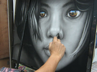
When thinking about ideas for what I wanted to do for my second portrait, I began by looking up images of portrait paintings, as well as looking at some pictures of my own in search of some inspiration. I scrolled through and glanced at several portraits, and pulled out ones that really stood out to me. After gather and selecting my top choices I realized that the portraits that seemed to really catch my eye were the ones that were quite drawn into the face. The closer up the more attention I seemed to give it no matter the style. Both realistic or photorealistic paintings appealed to me along with those that took on a more impressionistic style. There were also differences in the use of color found throughout the pieces, some (the more realistic styles) incorporated very little or no color, while the whole foundation of the other pieces were based on color. I thought about the difference the styles and the incorporation and absence of color had on the pieces. I came up with color and free style being associated with or sending a more emotional message. In contrast, the pieces without color seemed to be less expressive of the portraits emotions. Color seemed to portray the portraits own emotions while the black and white seemed less concerned about the portraits emotions and more about evoking the viewer's emotions. I feel the gaze took a lead role then in the black and white paintings to do this.

The next step was then to figure out what it was that I wanted to say about myself. After looking through some more recent photos and thinking about things that are important to me, I realized that though possibly still being influenced from my summer traveling high caused from my trip to Ecuador and the Galapagos Islands, that traveling and exploring new cultures and places is something that I really value, treasure, and would like to foresee in my future. 

Ideas of elements to incorporate in my portrait to convey this importance of traveling and experiences:

As a young kid my mom would always give colorful thread to my sisters and I to make bracelets with. We would learn different knots from our cousins, friends and bracelet making books and used all sorts of different color variations. I think we actually enjoyed making them more than we liked wearing them cause we always seemed to have more bracelets and anklets than we could fit on our wrists. Over the years that phase would come and go as it pleased and just recently in the past year or two it showed up again. Not only did I remember many of the patterns of my past, but I also looked up and learned some new patterns. This began my collection of bracelets on my wrist. My collection grew when going abroad this summer. Ever since, bracelets seem to come and go on my wrist as old ones wear out and fall off and new ones get added from places I've been, gifts from people I know, and experiences I've had. Their representational role could be useful in my portrait. 

As I mentioned earlier, traveling is something that although I haven't done a great deal in my life so far, it is something I desire for in my future. So for my portrait I think the idea of keeping an eye on the future and looking out into the world, but not really focusing on one specific spot is something I want to include. I think the gaze of the eyes would have a big role in depicting this as well as the scale of the portrait. A large scale can make the portrait possible less associated with the past or present time and maybe gear it more towards a bigger idea of the future. Where the eyes are gazing I think is also important. Though I think they should be lookout from the canvas, I think there should be a distinction made between looking out and over, not at the viewer. 

Chuck Close, Frank, 1969- I saw this piece during
 a trip I took last year to the MIA Minneapolis
Institution of art. I remember looking at it for some
 time while I was there. Though the details drew me in
to want to look closer at it the massive size of the portrait
 pushed me away from the piece. This was one piece
 from the museum that definitely stuck with me
beyond just my visit there.

Francoise Nielly
Stephen Martyn Welch

Artist Unknown

Tuesday, October 11, 2011

Practice 3: Portraits

I was quite enthused to start portraits. The human face seems to be something challenging, having so many features and slight angles and lines created from the bone and muscle beneath. I was anxious to learn the relationships of the face and learn a foundation of how to begin this challenge. While watching the demo before starting our own portraits, I began thinking how intriguing it would be to be able to see the x-rays of paintings. Viewers only see the final product of a painting, but they do not see all the steps and stages it takes to reach that point. Many artist may prefer this, but I think it is so intriguing being able to follow a person's thoughts and signs of growth or understanding of something by following the process it took for them to reach a point. Anyway, after learning some basic principles of the face and given direction on how to begin we got started on our canvases.

The first day I was in a painting mood, and was just having fun applying the paint to my canvas. I experimented with colors and application to understand how they could work together to for flesh. I didn't get too caught up in accuracy of both color and form at this point (seen in stages 1-5), but rather I just was going through more of an experimentation period. 

After our first short critique, which was focused mainly on the colors that made up each of our complexion, I then went back and put real consideration and thought to what I was seeing and continued more in this manner. Though I missed photo documentation of many of the steps in this shift, I not only payed closer attention to the colors of my flesh but also the forms that were making up my face. A big chunk of the paintings progression was done on my third day of work, where I was able to get into a focused state of mind and let myself be enthralled in the piece, which is why many of the intermediate stages seem to be missing.
 
stage 1:drew main construction of face
stage 2: brought in color 
stage 3:filled in space between color

stage 4: blending and started giving attention
to some facial features

stage 5: began eyes

stage 6: skipping ahead quite a few stages,
after dealing with the color of complexion,
 along with other colors of facial features
 like lips, and also beginning to think about
 the background

stage 7: continued work on background

stage 8: blurred background


Monday, October 3, 2011

Portrait: Artist Unknown


David Walker

Love this! Color and line is used so freely. It feels fresh and in some ways cleansing. I feel this woman is just letting go of all stresses in life and just relaxing as wind blows through her hair.

Monday, September 26, 2011

Progress continued

Painting with Color: Flower of Sunshine

Progress...

Painting with Color: Flower of Sunshine

I then began to add in shadows and more details into the pedals.

Painting with Color: Flower of Sunshine

Take 2: I started over on the pedals today. It was somewhat hard to do this, because I felt as if I was going backwards in progress rather than forward, I just had to trust it was like cleaning a room or something--it would get worse before it would get better. Anyway, I tried apply three different shades of yellow to the three rings of flower pedals, to give me somewhere to begin.

Painting with Color: Flower of Sunshine

This is a photo of my piece after our first critique. Areas of concern were: the contour, outlining look of the pedals; the flatness of both the petals and the background. 

Tuesday, September 20, 2011

Painting with Color: Flower of Sunflower

Photo is taken after work day 2. I had a rough time beginning this piece. When looking at my object I got overwhelmed with the amount of details that were in this one flower. There were so many individual pedals, each creating all kinds of shadows and now with color, those shadows were not just blacker areas but rather a color in them self. After some guidance, I begin just as I did in my value practice. I started sectioning pedals off and applying a solid color to their nearest tonal value. I did not have my camera at had at this stage, so I wasn't able to document the piece at this step of my process. Here I have just started to deal with the color and change of values in the center and with some of the pedals.

Painting with COLOR: Yellow Flower

My work space and a new white canvas! Daunting?...yes...exciting?...absolutely! We began our new practice today. COLOR!

Sunday, September 11, 2011

A fun play on words! 

"Color Matters"

On one of this website's links, it brings up the idea that a color can change its appearance depending on the other color(s) it is near. For instance, red may look bright and vibrant beside black or blue while appearing to be more dull next to white or orange. This brought to mind the idea of how each person seems to have a color or a couple of colors that they feel complements them best, whether based on skin tone, hair color, eye color etc. In addition this idea of color may also explain why some people are uncertain of their eye color. One day their eyes may appear green, another blue and yet another grey, all due to the color of clothing they are wearing. I just found this idea to be intriguing and something that I think would be kind of fun to experiment with.

Color Wheel


Lesson 2: Color

Color has a much stronger affect on us than we may consciously realize. Each and every color can evoke some kind of feeling or emotion. A change in the saturation of a color is one way of altering the emotion a color may represent. Even the juxtaposition of multiple colors can vary the mood it creates. Colors have a similar affect on people world wide, but when associations are brought into play, meanings of color begin to vary from person to person. Location of where one lives and experiences one goes through can all change one's perspective on color. As it is now more clearly seen, color can be a powerful tool when it comes to art. Artist have the chance to strategically use color to their advantage to convey the emotion, or message they are trying to unveil.

Theory of Color

Saturday, September 10, 2011


This is a photo of my painting on display at our critque. It was helpful seeing it in a cleaner and less distracting setting. It also allowed me to see it  from a far, which brought with it a chance of reflection on elements that worked and elements that were weak. Like what was observed in many of my fellow classmates pieces, compositionally, the folds in the cloth seemed to provide as a good tool to lead viewers eyes around the piece. An area of weakness is the close tonal value between the pears and the cloth causing the pears to get lost in the painting, even though they are  the largest of the subjects. Lightening the pears up was a good suggestion for an area of improvement, so that viewers could better identify these subjects and not have to key into some of the details such as the stems for identification.

Friday, September 9, 2011

Stage 3 Value Painting: Pears and Cherries

I spent more time refining the gradual and the not so gradual value changes of the fruit and cloth. To my surprise while doing this, I found it most difficult to capture the cherries waxy appearance. It may have been because although they did have a much more drastic value change, including some of the deepest blacks and the brightest whites, there were also some values in between that were sometimes difficult to spot or decipher. Finally, I went in with a finer brush and added the stems, again paying attention to light.

Stage 2 Value Painting: Pears and Cherries

At this stage I am still in the process of adding in all of the shadows and highlights. Marks are visible, since I have not yet blended them in.

Stage 1 Value Painting: Pears and Cherries


We began practice 1 of painting today using black and white oil paint to begin our focus on value. We began our process by first applying a grey foundation coat to the entire canvas, then outlining our major lines in black paint, and finally giving each subject an initial tonal value. After the major subjects were in place, the next step was to add dimensionality to the objects by bringing in shadows and highlights. This is the step where my piece is at now. I started the process of shading by spending much time looking back and forth from my still life to my canvas to see where the light is landing on the objects and where light is being blocked from. It was very easy for me to get enthralled in painting. It was quite relaxing and exciting as images started to gain shape.

Wednesday, August 31, 2011

Roger Federer Captured on Canvas in Four Minutes

Jean-Pierre Blanchard 4 Minute Painting

Artist Jean-Pierre Blanchard combines visual and performing art into one!


Collective Course Goals


  • Visually manifest content
  • Expression
  • Understand color
  • Push beyond comfort
  • Learn and improve technical skills
  • Collaborative learning
  • Take risks
  • Ignite curiosity
  • Find a sense of accomplishment
  • Cultivate good working habits
  • Develop content using historical approaches